Here at BadgeCaps, we are logo design optimization specialists! Our graphics team is here to help you take your brand to the next level by converting your logo into artwork that can be cut by our high-powered laser into a badge for your new Badgecap! Although we work with nearly all file types, knowing what you have to work with (and what to request from your logo designer!) makes all the difference when the time comes for putting your design on physical items like merchandise and apparel.
Today, we’re taking a basic look at the way branding assets are created, stored, and translated for use in various applications.
1 – FILE TYPES
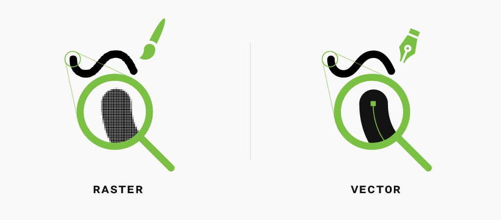
Firstly, digital image files typically fall into two broad categories: “Raster” images, and “Vector” images.
Raster Graphics
Raster graphics are what you might think of when you think of a photo, or digital image. They make up the majority of the graphics found online, or in print. Hundreds, sometimes thousands, of little mosaic-like squares of different hues and values, all come together to create the image, or “bitmap”. Therefore, the more squares used to make your image, the higher resolution your image will be. (We’ll touch on resolution in a bit.)
Vector Graphics
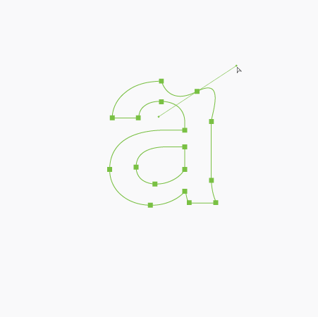
Vector graphics, on the other hand, are created by lines and angles, referred to as paths and anchors. Using precise mathematic formulas, the anchor points determine the direction and curve – or vector – of the path. Then, the image is created by “drawing” the lines between the anchor points. In other words, rather than the computer having to remember all of the pixels in the design, it just has to remember the anchor points. Therein lies the magic of vector graphics: you can scale the artwork by scaling the anchors as large or as small as you like, without losing image quality! As a result, this makes it the ideal file type for almost all digital artwork. Especially logos and design that will need to be edited, converted, or used for production in the future.
Therein lies the magic of vector graphics: you can scale the artwork... as large or as small as you like, without losing image quality!
Therein lies the magic of vector graphics: you can scale the artwork... as large or as small as you like, without losing image quality!
2 – Resolution
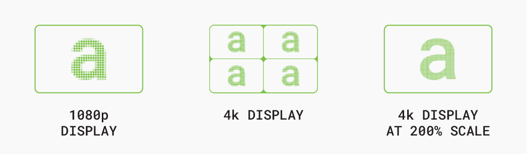
Secondly, for digital graphics, the standard unit of resolution is the pixel, short for “picture element”. The number of pixels across the height and width of your image is the Pixels Per Inch (PPI) of the image, referred to as image resolution. However, all of this is functioning in relation to the screen that you are viewing on. Which, depending on the native resolution of your display, could produce some dramatically different results:
Social Web
For the vast majority of digital graphics, 72ppi is recommended for fast load times. Considering the scale and the variety of devices that digital graphics are viewed on, any pixelation goes largely unnoticed.
HD Web
For graphics that will be full-width or high-detail, 150ppi is recommended to avoid pixelation in the finer details. However, these sizes will hinder web performance, so it is recommended to limit their per-page use.
Print Design
Print production resolution is referred to as Dots Per Inch (DPI), which is a reference to the density of pigment that the printer is able to lay. This typically provides a very high resolution representation of your artwork. Usually in the range of 300-600 dots per inch (DPI) for standard four-color production machines. However, some professional machines providing even higher ranges in the several thousand dots per inch.
Note: Keep in mind, this only applies to raster images! On the other hand, vector images can be used as-is, or converted or exported as a raster image at any resolution or size!
3 – Color Spaces
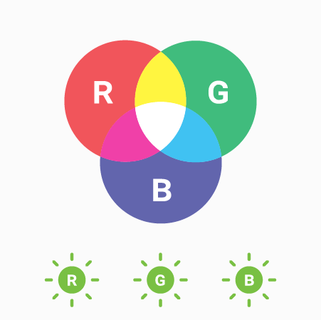
Thirdly, color spaces are also defined by the way they are constructed, and fall into two major categories: RGB color and CMYK color.
RGB
Red, Green, and Blue are the primary colors of light that make up the RGB color space. This is an additive process that combines various hues and values of light to create an image. This process is used to create the image you’re viewing right now – the white background is the combination – or sum – of all the colors of your screen, while the black of the text is unlit. For instance, this is the same process that can be seen in a rainbow when a prism, or a rainy day, divides the white light from the sun.
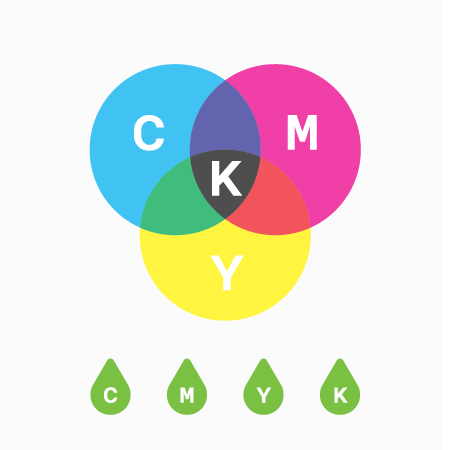
CMYK
Cyan, Magenta, Yellow, and Key Black (K) are the primary colors of pigment that make up the CMYK color space, which is a subtractive process that combines various hues and values of pigment to create an image. For example, this process is used to print a photograph or match the paint in your home. White is typically the starting medium (paper, drywall, canvas, etc.) that will be receiving the pigment, which absorbs – or subtracts – all of the light that hits it, except the color of the pigment, which is reflected and creates the image.
As you can see, because of the nature of the way these two mediums create color, it becomes very difficult to match the exact RGB color to the same CMYK color. In many cases it is simply impossible. In short, it is very important to make sure that it is clear what color space you will be working with throughout the project, and how the final product will be viewed. It is common for brands to have clearly defined color palettes for both color spaces. This ensures consistency no matter the project!
4 – Putting It Together
So finally, to best make use of your logo artwork or branding asset, you should have:
An Original, Working Artwork File
In CMYK, RGB, or Both
In Vector Format, or 600ppi or Higher Resolution
Now that you have these in your tool kit, all that is left is to determine the needs for the project:
File Type - How will you be exporting or saving your artwork?
Resolution - Where and at what size will it be used?
Color Space - Will it live online or in a physical space?
Our Process
In conclusion, the optimal format for our process would be a 100% at-scale vector file, in black only. If you don’t have that, don’t worry! You’ve made it this far, and we’re happy to help with any of your graphic needs.
SUBMISSION
After submission, our graphics team will take care of converting the logo to an editable format, and then will revise the artwork to optimize it for cutting, and to look great as your new badge. Having something to start with ensures that we all start the project on the same page, and the more optimized your artwork is for the project, the faster we can get you in some BadgeCaps!
PROOFING
Once we get your artwork looking great and working for the laser, we will present the revised artwork for review in the form of a digital mock-up, and make changes as requested. Once you’re happy with the design, your badge goes to production!


