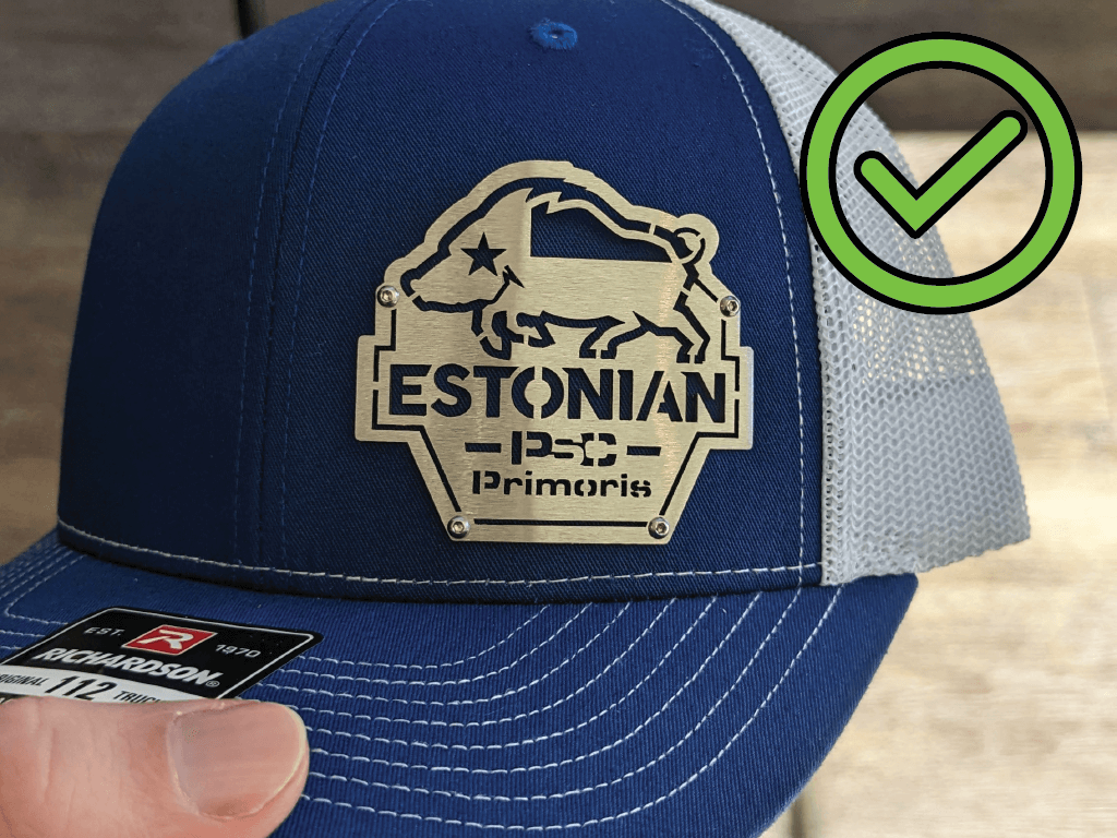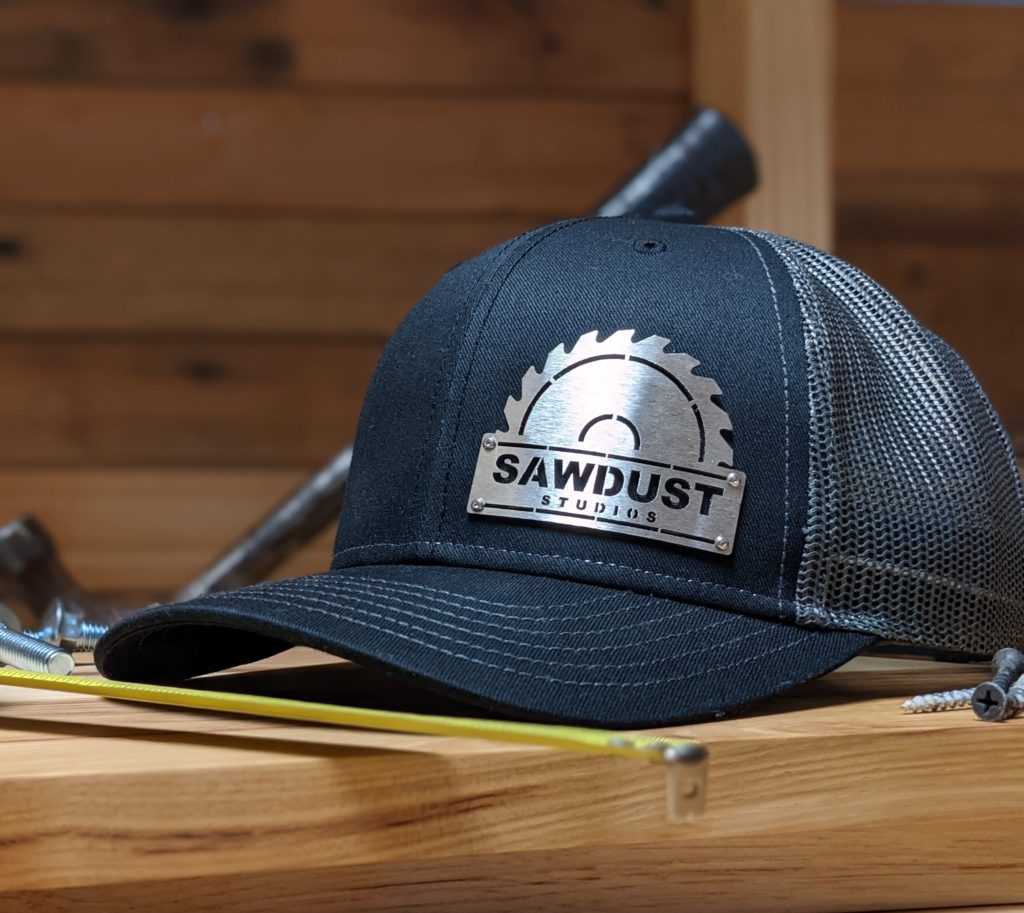
A design needs to work in-hand when someone that has received the cap examines it before putting it on. Or when someone asks to see the cap for a closer inspection. This is where the fit and finish shine! Here the final details like the stainless hardware, the brushed badge, and the cut quality are key.
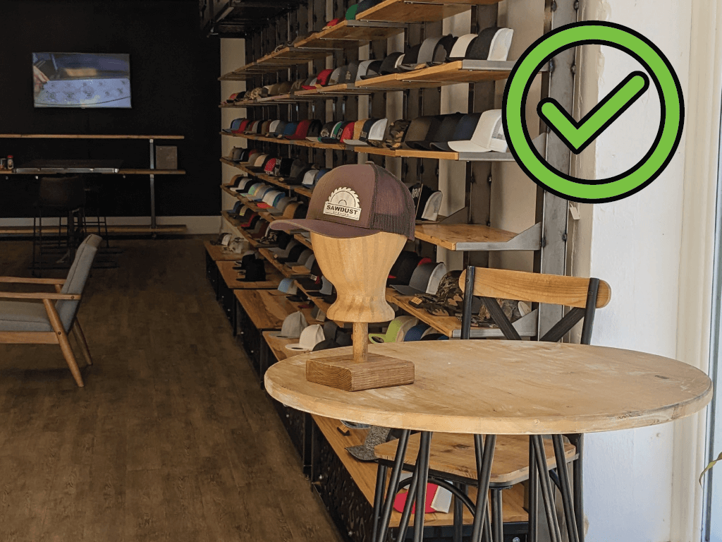
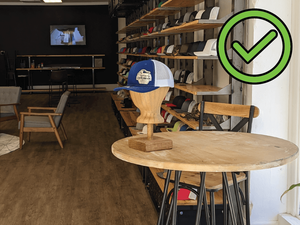
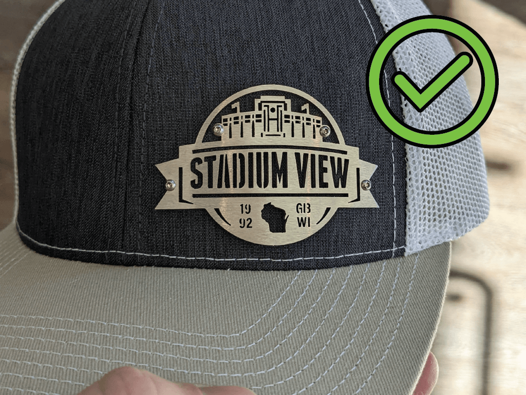
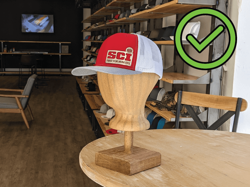
 Large, readable logo, distinct shape.
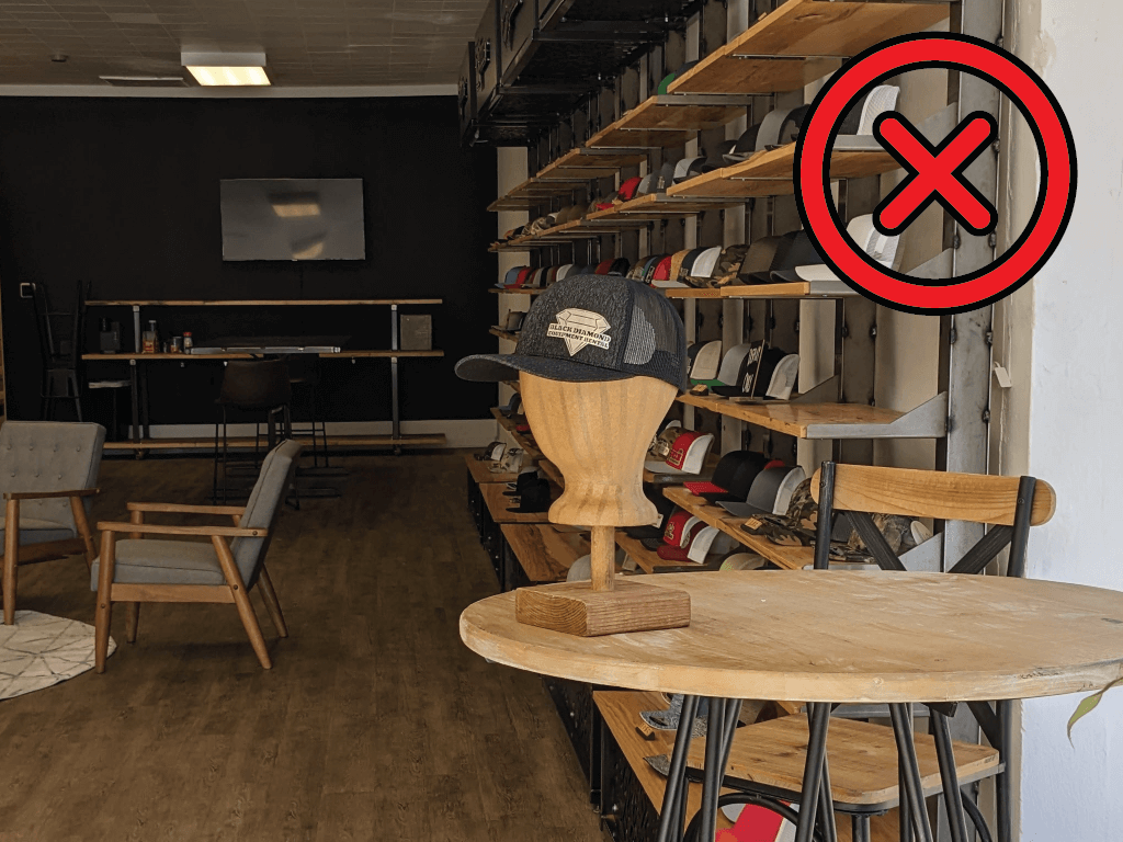
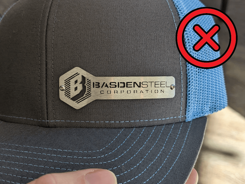
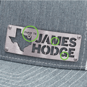
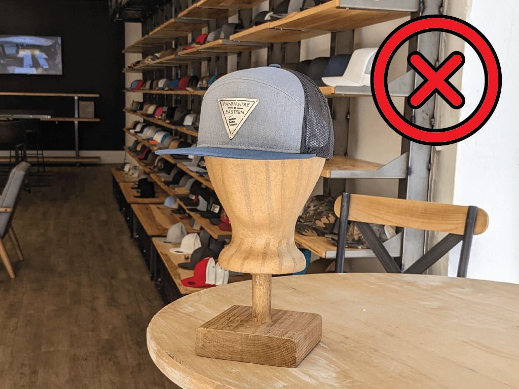
 Too much text, brand not recognizable.
And finally, the finish that we use for our badges makes them shine without being reflective. When you’re across the room from someone it catches their eye. This is where the shape of your badge design, and the cut-outs, are most important.
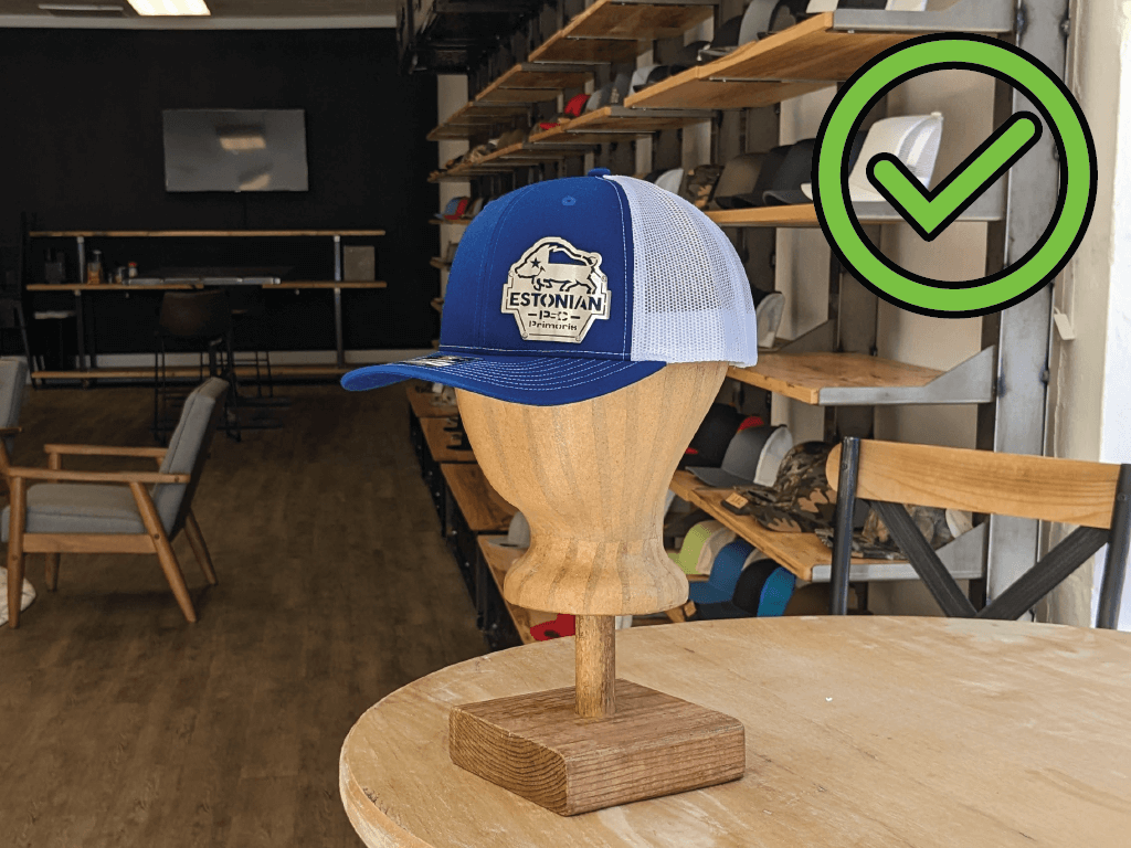
Your badge can have a shape that communicates your business services. Or a large, clear graphic that communicates what you do. It helps give you business context and a reason for someone to come over to speak to you about your business!
Distinct, recognizable overall shape.
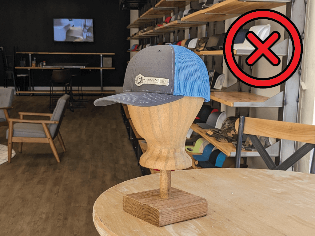
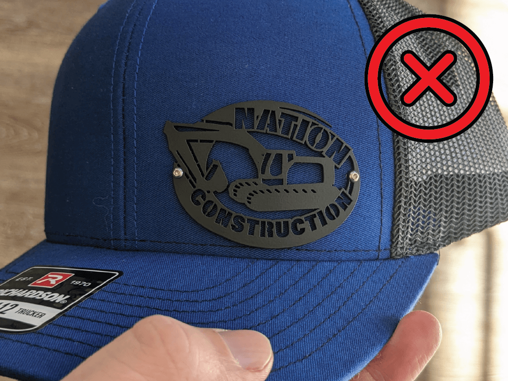
Text distorts overall shape, not industry-specific.